Problems
Outdated search platform
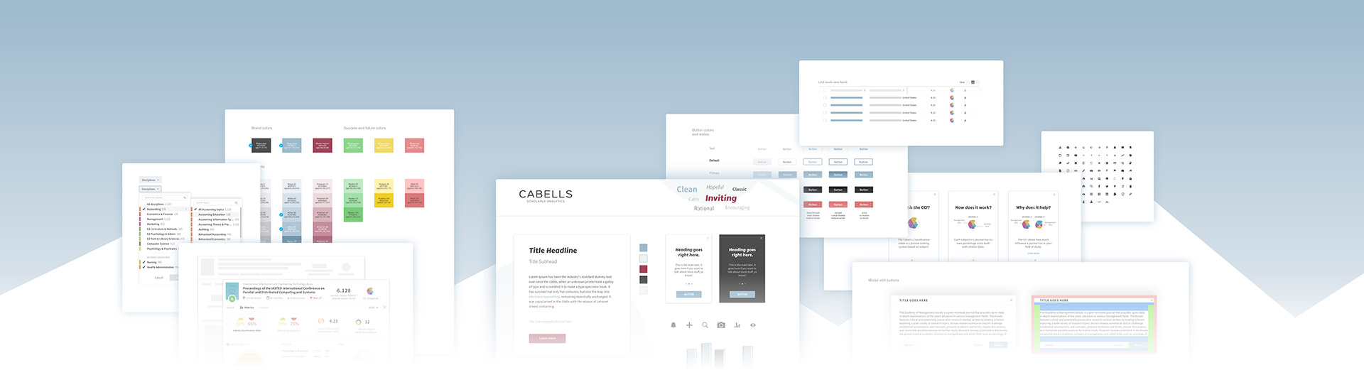
After the brand and marketing site redesigns, the next critical project was the customer search interface—our actual product called Journalytics. This is where the customer would spend all of their time looking for journals so it was the most important part of my job. I was already redesigning how the data would be displayed for each result, so the rest of the framework needed to be built.
Though functional, the search system was not user-friendly or attractive. The new interface needed to be flexible and logically organize journal information.
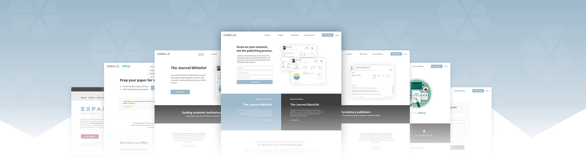
The old marketing website, which also acted as the search system, included an account management system that few used because of its poor functionality. Our customers, frustrated, usually ended up calling our support team for help.
Old search interface

Old subscription screen

Old checkout screen

Requirements
Build a search app from the ground up
Spoiled by modern technology, I was adamant about using a single page application (SPA) for the interface to quickly update the interface dynamically. Results should quickly show any changes from filtering or new searches without having to reload the entire screen.
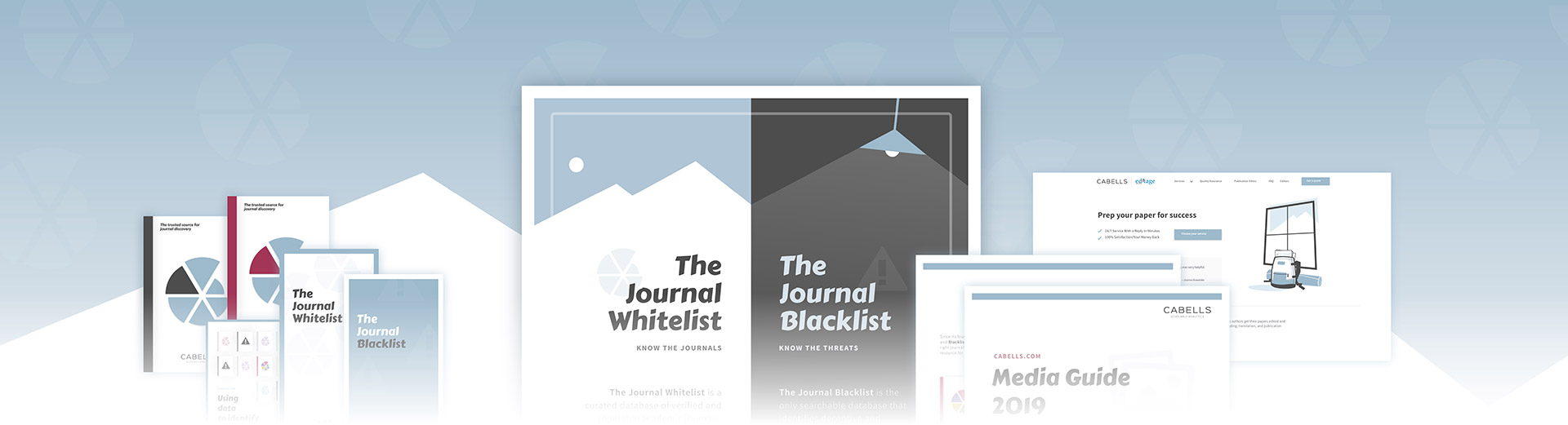
Our company was also developing a new version of our product at the time (Predatory Reports), a way to identify predatory journals in addition to verified ones. This needed to be added.
The account management system needed an overhaul in addition to my suggestion of distinct user profiles separate from the university accounts already in place. This would allow users to save journals and personal settings.
Finally, I wanted to continue the branding and UI/UI improvements from before with visual enhancements and better onboarding of customers—guiding their journey and explaining complex metrics in simple terms.
solutions
Steps of the process
This walkthrough shows the process for designing the search interface. To see the process for creating the journal cards that show up in search results, check out the case study here.
Research and design
I started with discussions about business priorities and customer complaints, then moved to UX user flows, sketching, digital wireframes, mockups, and then prototypes before handing over the process to our devs.
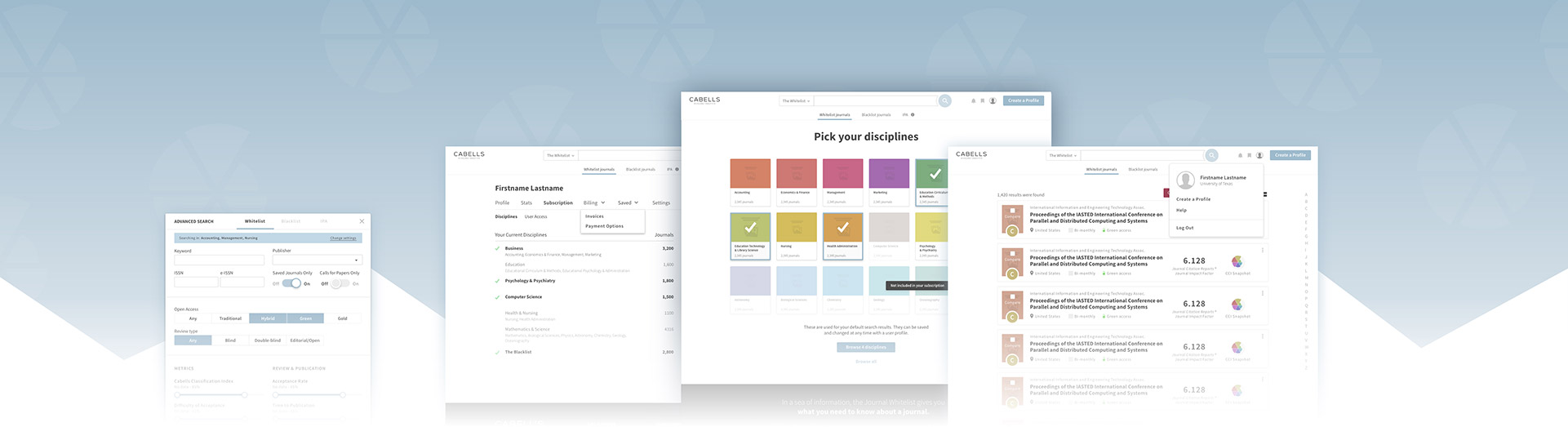
Logging in with personal profiles
The administrator account system would be used for billing, user management for campuses, and displaying usage data. This would be built on top of a general user profile system that included individual accounts for saving lists and search settings.
The new login system ran into difficulty because of the way campuses distribute access to students. Students are only allowed to log in through public, on-campus computers. I wanted to make it as easy as possible for anyone to quickly log in and search without needing to verify campus IPs. I created designs for different types of accounts that would progressively allow more access based on their permission level.


We created onboarding processes for administrators with new accounts. Once set up in our system, anyone who was on campus could quickly log in and search. If they wanted to save journals for later, they could easily set up an account. All of the complex login issues, with IP and firewall complications, authentication, and security, would happen behind the scenes. We included options to add personal info , manage subscription details, view usage stats, save lists, and save search settings.


Subscription management
Even though we had an online payment system set up on our website, customers were used to making payments over the phone because of functionality issues and confusing invoices. I felt like this was a waste of time for our employees to handle manually so I designed a new online version. It would allow customers to track product subscriptions, view past invoices, save payment methods, and make payments.


Onboarding new users
Most users had no idea when the website had been updated so I designed onboarding modal messages to display with each release of a new feature. I wish I had more time to work on these because I think they are critically important to how users are introduced to our product.

The search system layout was the hardest and most important part of the customer interface. There was such a wide range of ways customers used our product so it needed to be flexible and simple to use. Our engineering team looked for ways to make it faster, but I was responsible for the underlying UX and UI. I created an onboarding method for quickly browsing journals by discipline instead of being thrown into thousands of results. This preference could be saved for future searches with a user profile.

New search system
The main search bar would be the default way to search for journals, with dynamic results being previewed and categorized in the dropdown window. We replaced the advanced search popup I originally designed, which was a little overwhelming, with a set of simple filters and sorting system that would update the list immediately. I also created a feature for comparing journals next to each other. Customers could now find a journal by any method they chose, whether they casually browsed or knew exactly what they were looking for.
I suggested we use Angular as our JavaScript framework to make development quicker and more powerful for loading results. We ran into some compatibility issues with campus authentication, but this set a good foundation for us going forward.


Filtering and sorting
Following a basic search, users should be able to refine their results with filters and sorting. This took some time to plan for every variation and unique way to adjust data—from sliders to text input. I chose a horizontal region instead of a sidebar because lots of options tend to get lost and hidden from view. It was important to simplify the filters and group any similar concepts into the filter to avoid extra clicks. Button states and tags would visually indicate what filters had been set.


Insights
Challenges
In the end, I overestimated what our engineers could build. I spent more time explaining concepts, creating bug tickets, and simplifying designs so we could launch the product. The end result was still a huge success, but I could see what was compromised. The customer complaints that we would receive going forward were a direct result of these compromises.
Our search logic was not smart, results failed to load half the time, and customers still had trouble logging in. Our accounts team preferred to manage subscriptions manually, so the payment system was the first thing to be cut.
Despite launching Predatory Reports on schedule, there were some difficult internal debates about announcing arbitrary hard deadlines for new products.
Other challenges
Impact
We made huge advancements for our team with the new search interface. It felt unified with our branding, and it improved the customer search experience in every way. It laid the technological and design foundation for us to add improvements over time and start building an entirely new platform for the medical community (2022).
The new products led to an increase in revenue and a hiring frenzy (new journal auditors, managers, directors, and sales teams). We expanded to new international markets and partnerships.
On the flip side, the amount of customer complaints compared to the internal satisfaction with design mockups led to a better understanding of needed resources and recent investments in tech, planning, and expertise.
The biggest win for us was the new Predatory Reports which has become our best selling product since this introduction in 2017.

Related projects