Problems
Identity crisis
The previous brand identity wasn’t ever thoroughly planned so the colors, fonts, and websites felt unfocused and pieced together. The new brand design needed to reflect the company personality and address every digital element.
Old Logo

Old website

Old Decorative elements

Requirements
Find an authentic look and voice
After so many redesigns over the years, this was the last chance to get it right before our execs gave up trying. We needed to discover our authentic, core team identity and then design visual elements to match. This meant creating a unified, comprehensive design to be used for marketing, branding, product design, and all digital interfaces using one vision.
We had a chance to clean up some of our reputation and reenergize the company going forward. The new look had to feel professional, trustworthy, and make us feel proud.
solutions
Steps of the process
Research
In order create an authentic vision, I needed to get a deeper understanding of who we were. I interviewed our execs in sort of a therapy session to discover what our mission and values were and what customers came to us for. We came to an agreement that our company was more of a guide than an absolute authority. We were more like librarians than judges or police (in regards to predatory journals). We were small, introverted, and cared more about helping young researchers without the resources of larger institutions.
I also gathered some generalized information for user personas that could be used later for website redesigns and marketing campaigns.
About the name
I suggested two changes to the company name; one was a bit more controversial than the other. First, I chose to simplify our official name to simply Cabells. Previously we had gone by Cabell’s International, Cabell’s Publishing, Cabell’s Directories, and a few others.
Second, in order to transfer some of the personal identity of the product and company from the owner’s name and create more of an abstract team entity, I removed the apostrophe (Cabell’s -> Cabells). The company was no longer associated with just one person. I felt that this would encourage a feeling of personal ownership for each team member.
First step – retro blue
Where to start with the visual design? I needed some familiar element that could be used as a transition from the old Cabells to the new. As a first step, I chose a single element that I had unconsciously associated with the company during my short time there—a pale shade of blue.
Sources of inspiration
The next step was to mentally condense the company down to a few personality traits and core goals to build a design framework around. Matching specific design styles would come later.
We’re a small, quiet company without a corporate feel so the words I settled on were introverted and relaxed. The mission of the company is to improve the academic publishing process for the advancement of society—an idealistic concept that harkens back to the scientific curiosity and nervous optimism of the Atomic Age. Truth and progress are still important concepts in our age as well, and neither is guaranteed. It just so happens that the pale blue color fit into the now retro mid-century style of that time period.
After some brainstorming, the vision that came to my mind was that of an intimate group of scientists living in the mountains away from the pressures of the city, quietly working on their research. This is what the visual identity would aim for.
Whenever I set out to design something that feels unique and authentic, I like to use at least 3 different sources of inspiration to pull from. This guarantees a sense of familiarity with just enough variation to avoid tropes and clichés.
In this case, I chose:
- the Atomic Age/mid-century aesthetic
- the reflective and creative mentality of cool jazz
- the quiet solitude of snowy mountains


A new style started to form that included simple geometric shapes, solid and heavy “inky” icons surrounded by empty white space, and slightly muted colors. My final goal was to refine it into a classic and inviting identity.
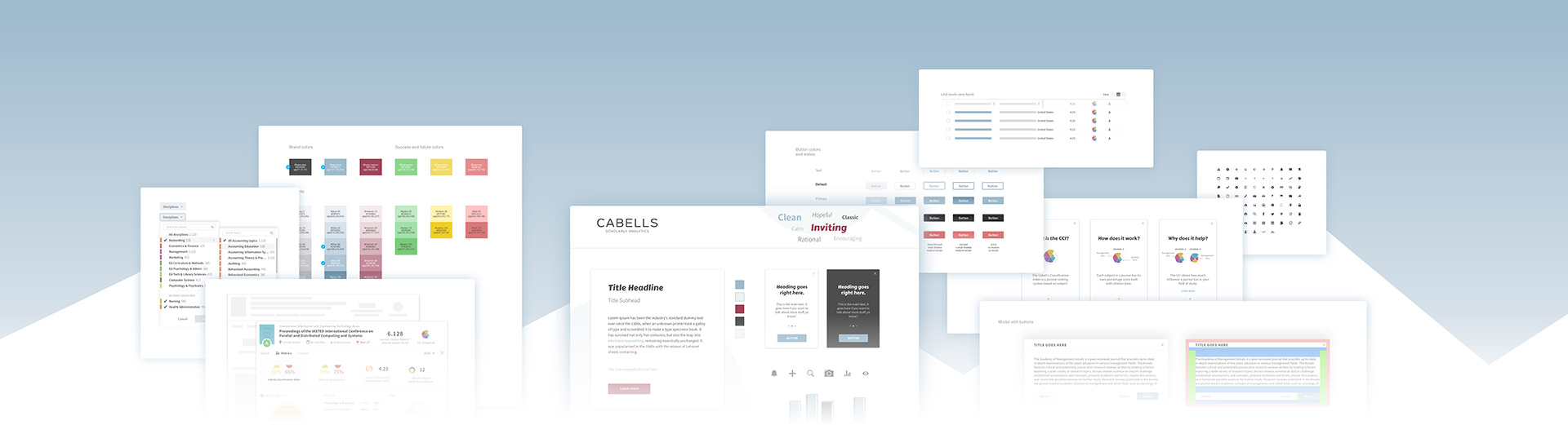
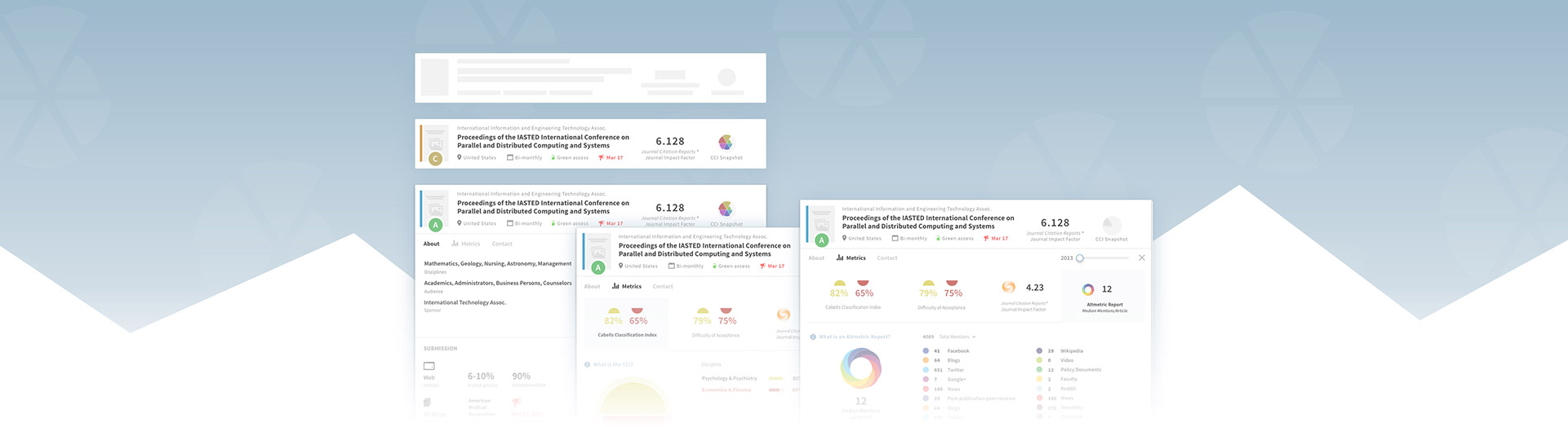
New style guide

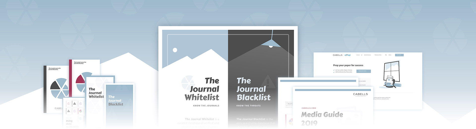
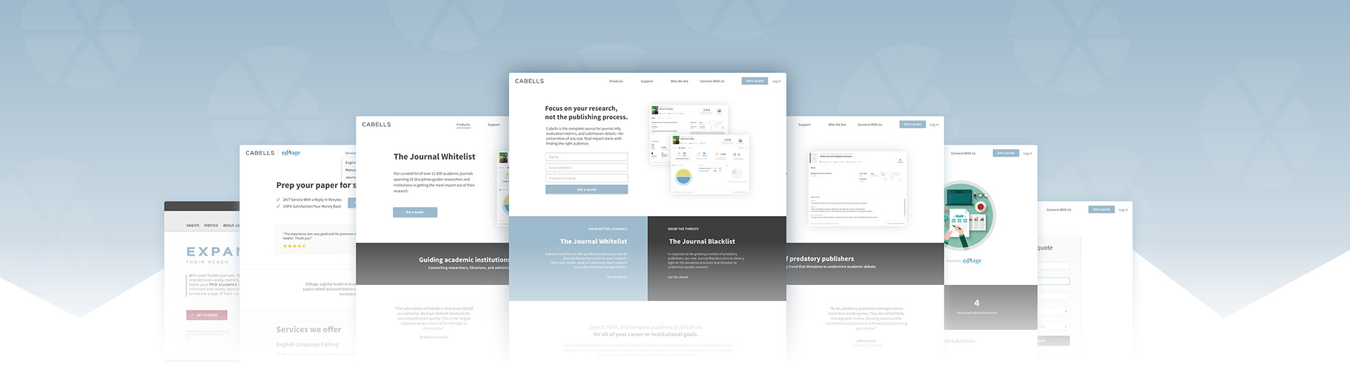
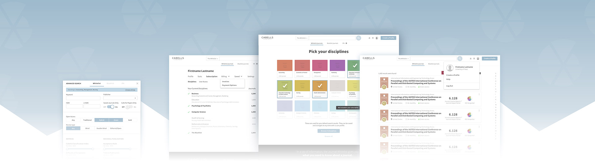
Products
At the time, we were developing a new version of our search app that would look for bad journals instead of good ones. A light and dark dichotomy for opposing product goals seemed to lead right into light vs dark imagery—predators hiding in the dark. There were some unintended connotations with this imagery and the name of our products which led to us changing the product names later.

Imagery
I chose not to highlight stock photos because they usually lead to a fake, corporate feel. Instead, any photos we used would be forest imagery and used as subtle background textures. I also chose not to use stock photos of people for a similar reason, to avoid any debate about demographics or audience pigeonholing. At this point, we really didn’t have the design resources to start using a bunch of imagery.
Flyer with forest background image

Logo
The first logo I created was well-received but was deemed too unusual for an academic company. It was inspired by the ideas of looking to the stars and passing wisdom down from generation to generation. I’m not including it here, but it basically showed a mama bear and baby bear.
So, with the last minute change, we abandoned the use of a logo. Instead, I cleaned up and updated the old wordmark. I would continue to explore logo concepts over the next few years.
After updating our flagship product’s main metric (and chart type), I transformed it into a logo to use for our company branding. This nautilus shape stayed in use until recently.
After lots of debates and iterations over the years, I finally came up with our current design. It combines imagery of a ribbon bookmark, our geometric mountains, and an open book/journal. I had been wanting to avoid using abstract shapes (popular in the tech and academic industry), so I was very satisfied when I was able to create a visually simple logo with some conceptual depth.
2016 Wordmark
2017 Wordmark with nautilus logo
2020 Logo
Brand voice
The last part of the branding redesign wasn’t visual. To match the visuals, though, and the unified identity, I worked on establishing a brand voice to be used in copywriting and content. This would include mottos, taglines, body content, and all text intended to be read by customers.
The academic industry is notorious for writing with complexity. We are a service company, so I emphasized a much simpler approach to help relay information quickly and without complexity. Our writing is somewhat casual and aims for 6th grade reading level.
For an example of what our voice would sound like, I immediately thought of the 1950s Walt Disney documentaries that would explain complex subjects in simple and approachable ways. Those would act as my templates for how we would explain our products, metrics, and all other copy.
Insights
Challenges
This process felt a little like therapy. We had to deeply explore who we were, including the bad stuff, so that the true part of us would live in the designs. There was fear about looking different than other companies in our industry and trying out styles that weren’t stereotypical. We also had to throw away some designs that I was proud of because of some last-minute direction changes.
Other challenges
Impact
This was a successful redesign. Despite any challenges and small visual evolutions since 2016, Cabells has proudly used this established identity for years now. We’ve been able to efficiently reuse decorative elements throughout marketing materials and websites. This project also acted as a foundation for building a larger design system later on.
Cabells now has recognizable branding that has allowed us to establish trust, familiarity, and professionalism across all of our products. This has led to company growth and happier customers.

Related projects